
website design & optimisation
Elliot Organics
The situation
Elliot. had a genuinely beautiful product and a clear ethical mission: organic cotton, made without harmful chemicals, kind to skin and planet. What wasn't fully working was the website. Strong imagery existed, but it wasn't being used to its potential. The navigation hid what made the brand special, and the product pages weren't communicating the quality and values that set Elliot. apart from mainstream alternatives.
What we worked on
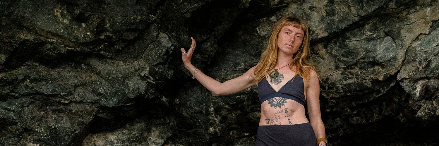
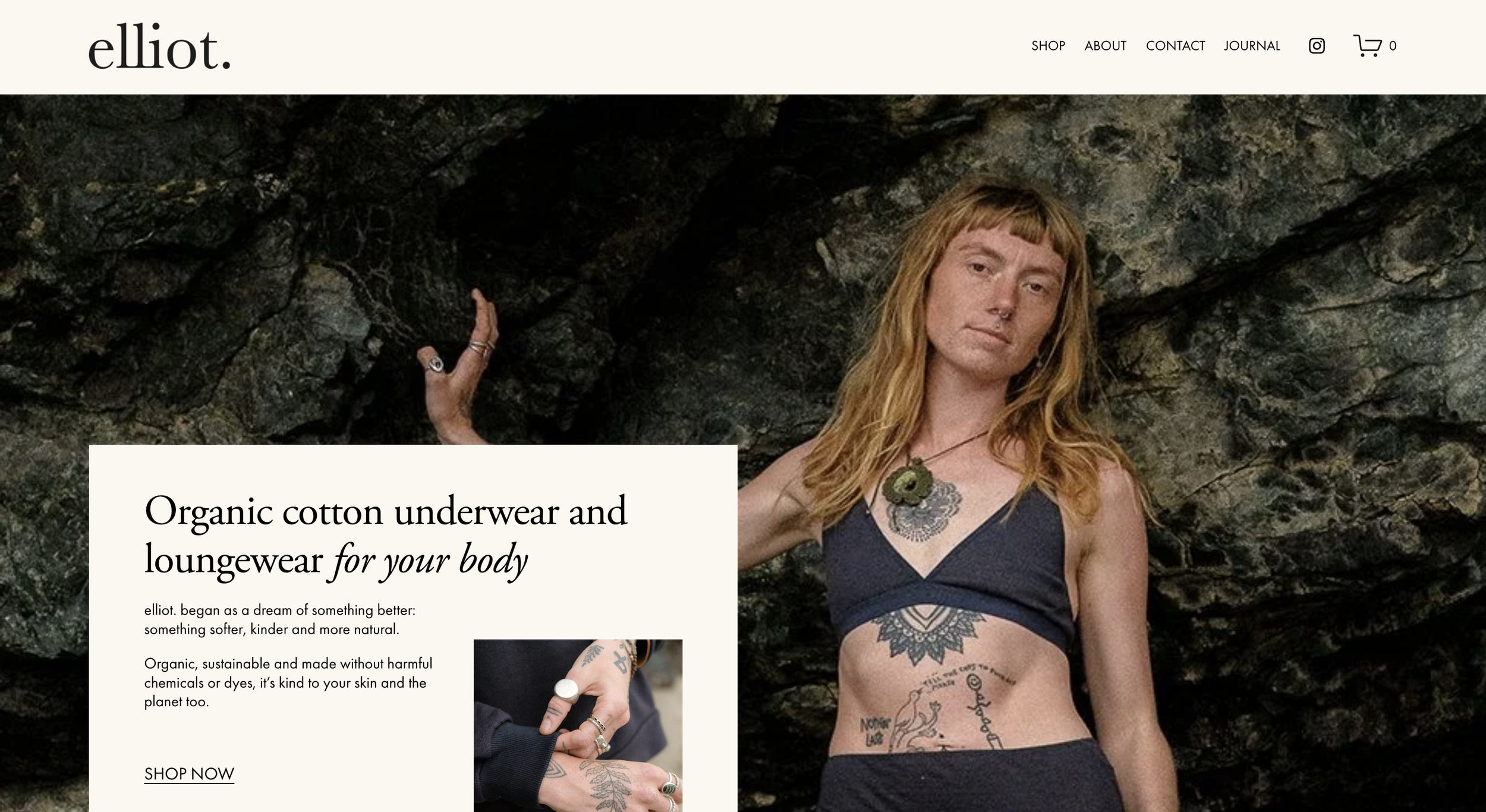
The starting point was the homepage: rethinking the user journey from the ground up with the brand's imagery at the centre of it. Elliot.'s photography is striking, and a close-up shot within the hero banner of the organic cotton fabric immediately communicates the quality and tactility that no amount of copy can replicate. We incorporated a scrolling press banner to build immediate authority, along with a scrolling review section at the founder Alex’s request.
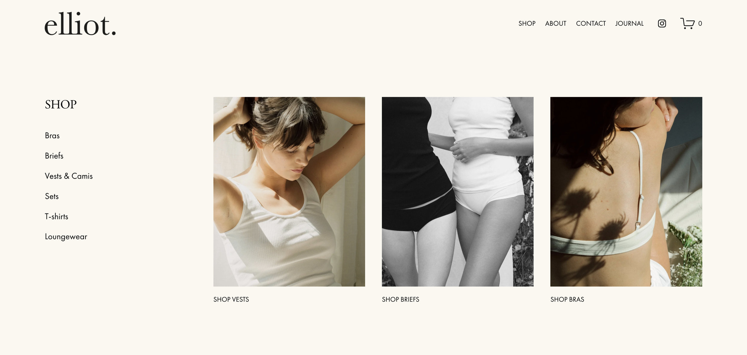
Navigation was overhauled with a mega menu, making the some of the main shopping sections e.g. Vests, Briefs and Bras visible and explorable from the scroll, rather than requiring visitors to hunt for it.
The site was fully optimised for mobile, where a significant portion of the brand's audience shops.
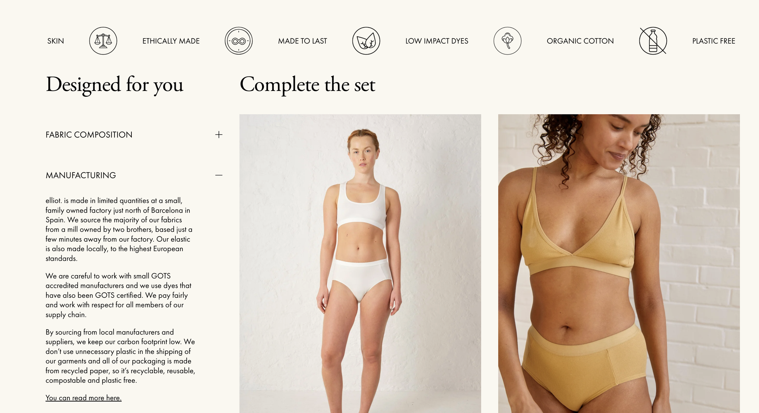
On the product pages, scrolling feature icons were added to communicate the brand's core credentials (natural, plastic-free, organic) at a glance. A "complete your set" function was introduced to surface complementary products and support a higher average order value.
A dedicated press page now gives the brand's editorial features a permanent, shareable home.
The result
A site that finally matches the quality of the product it sells. Every touchpoint (from homepage to product page), now works together to tell Elliot.'s story clearly, build trust quickly and make it easier for the right customers to buy with confidence.
+25%
organic search traffic increase in the first 9 days post-launch
+28%
total traffic up month-on-month
+17%
average order value increase within first 9 days post-launch
+65%
total traffic vs. pre-launch baseline
(4.4k → 7.3k)
+43%
aov, pre-launch to first full post-launch month (£89 → £127)
+96%
conversion rate doubled vs. pre-launch baseline (0.25% → 0.49%)
The website project
Pho The Marketing Collective provides website strategy, homepage optimisation and product page design for independent fashion brands, sustainable clothing labels and ethical product businesses. Working with founder-led brands who want their online presence to reflect the quality and values behind what they make. Based in Brighton, working with independent brands across the UK.
Interested in working together?